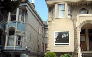
 I was going through my San Francisco pictures again when I noticed something unusual about this one. I pointed my camera out of the car window and just clicked as we drove along. One of the pictures, above, was of two of the City's grand Victorian ladies. I must have looked at this picture several times when suddenly I blinked. They were the same design. Same entrance, same second floor windows, same gently curved bays. And then it hit me - the window on the right was different; it had been altered. The gentle ornate curves on the left should have been repeated on the right but there on the right I saw only one plain square window surrounded by square, unadorned walls.
 I don't understand people. If one is lucky enough to own one of these great old houses, it stands to reason that one would want to preserve its stately beauty. I mean, wouldn't it? What drives a person to make a decision to slap a mid-century add-on to such a graceful structure? Is is lack of imagination, lack of money, lack of time, lack of caring? What? I'm baffled. The stark contrast is too much. I can hear the house on the left whispering "That could have been me". I can hear the house on the right weeping for its loss.
10 comments:
I have to agree with you Annie,,why would someone want to mess with some that looks so grand to begin with? I hope all is going well for you!
The one on the right is a Glamour "don't"
A fun insight, Annie :-)
I agree with you. I hate seeing older structures "modernized" in some way like that. It doesn't work.
Where are the craftsmen of today who can do that intricate kind of work? Maybe that's why everything gets done in the boxy, new shape...it's easy and anyone can do it!
Ew, I agree. The trend to go Mod is one that needs to be left in the gutter.
That is terrible that someone has been able to do that to the house? Is there no heritage listing systems for buildings? How can anyone be so insensitvie as to put that window in? xx
Once you pointed it out I totally agree, that square window is hideous! It'd drive me nuts to have to look at that regularly.
Janet hit some of this right. We built our home and everytime I mentioned a wall had an angle the builder would ask "are you sure you need an angle there, a straight wall would give more room and would be easy on me". He drove me crazy, so I let him have his way and now I am unhappy.
Apparently those homes are not registered and plaqued for historical architectural design. In Illinois many years ago when a house was plaqued the outside had to remain true to its original design but the inside could be changed.
So many wonderful old, beautiful homes are being changed or torn down because of money or taste. Its sad. I'd like to think your post could spare at least one old home from design ruin.
Babe
I don't get that at all.WHY would you do that?? Some people don't know what they have...
Interesting take on the Scribble!
:)
I must have missed this one, what a travesty! Creative idea.
I love old architecture and I hate to see it when it has been "updated." It's very sad, indeed.
Post a Comment